If your data model contains hierarchies made up of image URLs, those hierarchies can be added to Grids and Cartesian charts and the images at the URLs displayed in the visual. Click here to learn how to configure image URL columns in Model.
- Click here to learn how to configure Image URL columns in Model
Configuring an Image URL
Before you begin
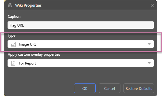
To specify that each content item in an Image URL hierarchy should be shown as an image, you need to ensure its Type is Image URL. You can either set the Image URL Category in Model or right-click the hierarchy in Discover (in the Dimensions panel or drop zone) and set the Type in the Properties panel:
Once your hierarchy has been designated as an Image URL type, it is displayed with an image URL icon in the Dimensions panel:
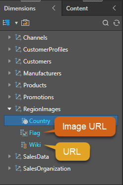
Note: If you do not assign your image URL hierarchy the Type "Image URL," it will be displayed in Pyramid as text. Selecting the Image URL option ensures that the image at the location described by your URL is shown in your discovery.
Adding the image URL to your discovery
- Create a discovery of one of the supported types:
- Drag your Image URL hierarchy from the Dimensions panel and drop it into one or more of the following drop zones:
- For Grids, you can add it to the Rows, Columns, Filter, Color, or Tooltip drop zones.
- For Cartesian Charts, you can add it to the Categories, Trellis Vertical, Trellis Horizontal, Filter, Color, Labels, Tooltip, or Motion drop zones.
Once the Image URL hierarchy is added to the grid or chart, the images appear in the visual in the appropriate locations:
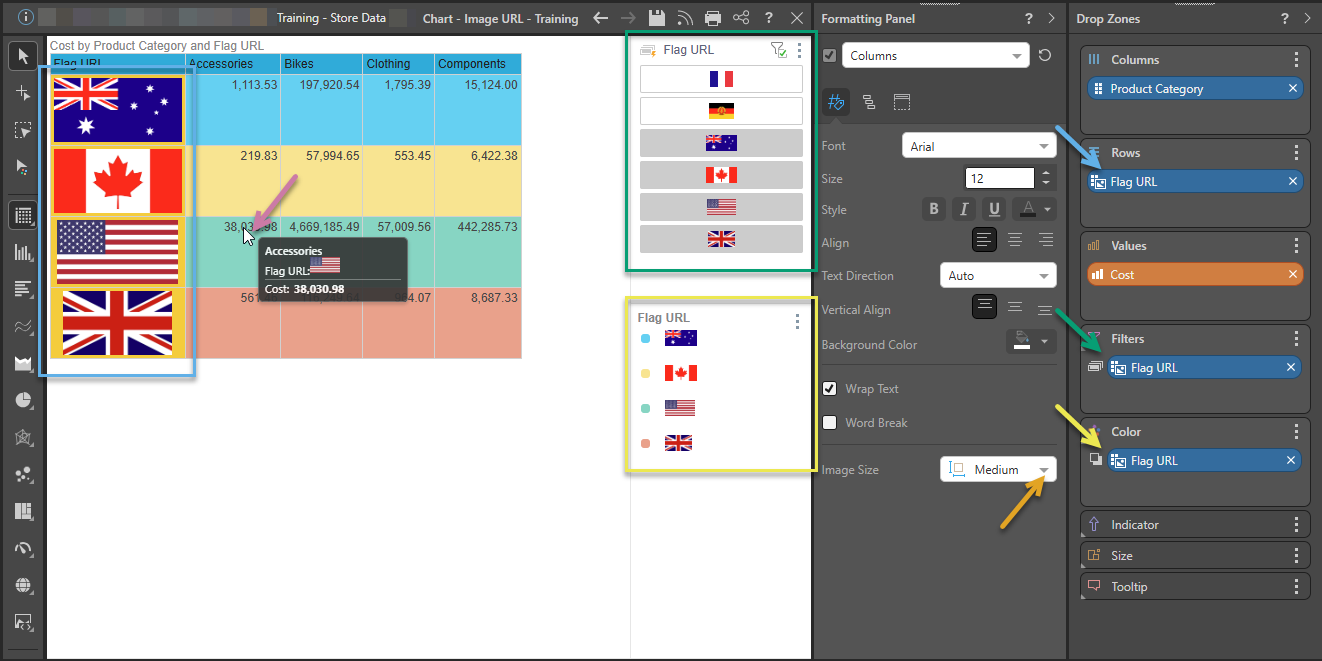
 Example 1: Grid with Image URL in Rows
The following example shows how the Grid looks where an Image URL hierarchy chip is added to the following drop zones:
- Rows: Adds the images to the Row Header cells (blue below). The size of the image in the Rows or Columns drop zones can be controlled using the Image Size option in the formatting panel (orange arrow).
- Filters: Adds small images to the slicer visualization for selection (green). The size of the images in the slicer is not affected by the Image Size option.
- Color: Associates a color with each of the items in the hierarchy and creates a legend showing the mapping between the color and the images. The size of the images in the legend is not affected by the Image Size option.
Note: When you hover over a measure in the grid, the Tooltip opens (purple arrow). Where the column or row header contains an Image URL, the tooltip contains the relevant image. You do not need to add the chip to the Tooltip drop zone.
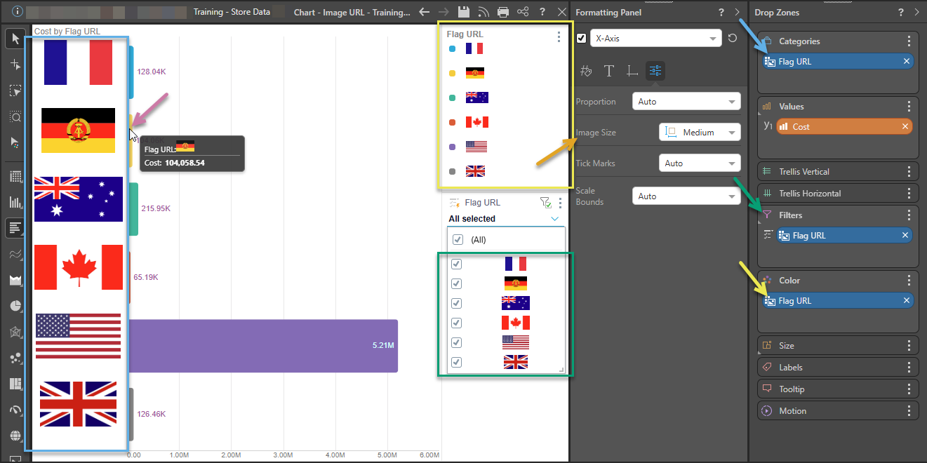
Example 2: Bar Chart with Image URL on Axis
The following shows how a Bar Chart looks where an Image URL hierarchy chip is added to the following drop zones:
- Categories: Adds the images to the main axis (blue below). The size of the image Column can be controlled using the Image Size option in the formatting panel (orange arrow), here it is set to a Medium size (larger than the default).
- Filters: Adds a small image into the slicer visualization for selection (green). The size of this image is not affected by the Image Size option.
- Color: Associates a color with each of the bars and creates a legend showing the mapping between the color and the images (yellow). The size of the images in the legend is not affected by the Image Size option.
Note: When you hover over a measure in the chart, the Tooltip opens (purple arrow).
Tip: You can right-click the hierarchy's members to interact with them.
Related information
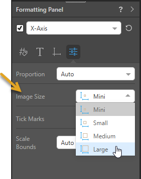
Customizing the Image Size
To alter the size of your images, use the Image Size option in the Formatting panel. For Grids, this option is seen when you select Rows or Columns in the Formatting panel. For Cartesian Charts, it is seen when you select X-Axis (orange arrow below). Selecting an Image Size option affects the size of all URL images in the main drop zones (Rows and Columns, or Categories and Trellises).
- Click here for more information about Image Sizing